Modernizing Google Drive
Modernizing a product loved by 1 billion people.
context & prior experience
Google Drive is one of Google’s highest profile products, used by approximately 1 billion people worldwide — from employees in Fortune 50 corporations (including Google!) to startups; from college students to Girl Scout leaders organizing their troop’s files. As I joined Drive it celebrated its 10 year anniversary, evolving from a personal storage solution to one supporting businesses and consumers alike.
My goal with Drive was to deliver a user experience that was at once modern and delightful, while making it easier for people to find and organizing the files they need. I also wanted to develop UX leadership within the Drive organization, ensuring that decisions remained user-centered and UX helped steer product strategy.
before
Drive web used an dated design system and finding files was primarily through search or navigation.
Process
As the leader of a large product and design organization, the process for modernizing a product and establishing the strategic role of UX is complex and multifaceted. Below hints at one major effort I led to establish a user-centered strategy with the heads of engineering and product.
A workshop with the Drive leadership team that I co-led with Research. This drove our 2023 plan.
Redesign & new functionality
Various elements of the user-centered strategy and redesigned experience were launched throughout 2024. This enabled us to carefully measure the impact of each release. But one additional benefit is that it created what I called internally “the year of Drive;” throughout 2024 every month had major UX improvements and new features, spread across Drive’s web, mobile (iOS and Android) and desktop experiences. This series of releases added tremendous value to Drive’s users (and organizations), while demonstrating to the world that Drive continues to evolve and be a favorite storage product around the world.
A handful of highlights follow…
after
A new landing page for Drive to enable people to quickly find what they need. We greatly improved finding by way of new filter chips, a homepage with suggested files, and improvements to our core search functionality. And we launched a new design language.
As shown above, we redesigned the entire web experience using Material 3, coordinating our redesign launch with Docs, Sheets, Slides — peers in the Workspace ecosystem. We also helped evolve Material 3 to the web - one of the first orgs in Google to apply this design language to the web. And we launched Dark Mode…
after
Drive dark mode
after
Sometimes very small changes have a meaningful impact on users. One of one small-but-mighty quality of life updates: Quick actions visible on row hover.
after
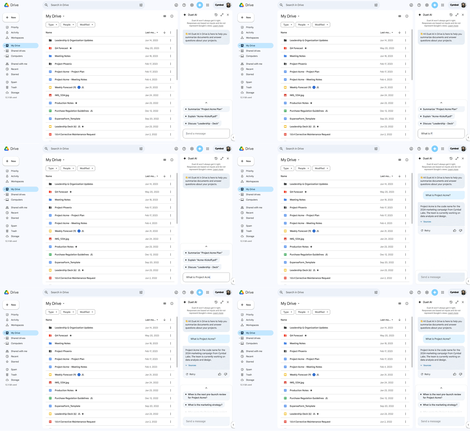
I also led the implementation of Drive’s first GenAI experiences (at the time called Duet AI, now “Gemini”)
after
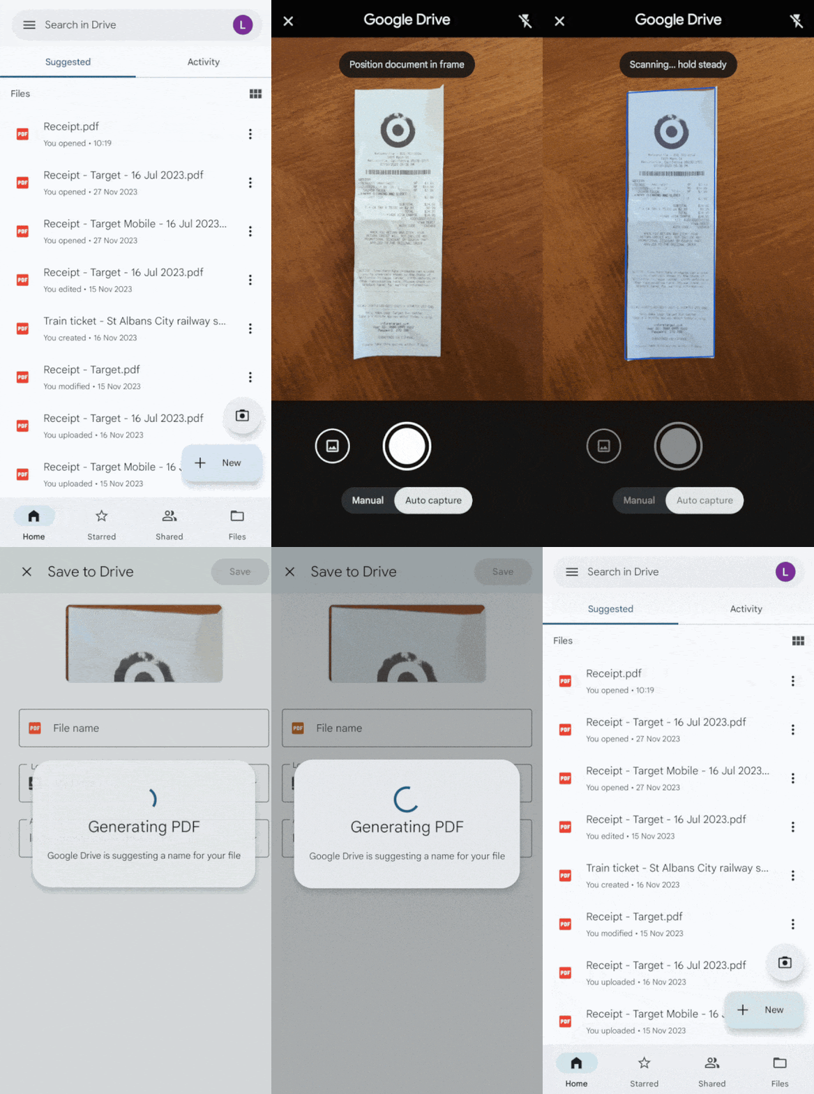
Another huge quality of life update:
A redesigned Drive mobile scanner.
Outcomes
One of the goals I had for Drive is to ensure users - and the market - could see that we were deeply invested in making Drive the best storage and collaboration product in the industry. And I’m happy to report users were delighted, and the market did indeed take notice:
Assorted media…
Leading the Drive design team was an honor, but I’m also proud of the work I did to elevate design’s role in the organization and ensure Drive delivered meaningful improvements to uses.


