
alaskaair.com Redesign
Building an airplane in flight:
Evolving AlaskaAir.com & its UX organization.

context & prior experience
I was hired to establish and lead the AlaskaAir.com UX team. The team’s UX staff had formerly reported to various other roles and I was its first dedicated UX leader. And as my first assignment, I was to lead a comprehensive redesign of the Alaska Air website — making it more modern visually and improving the experience, but also making it responsive, accessible (WCAG 2.0), and improving conversion rate and the ability to upsell products and services. So, my goals were twofold: to redesign the site but also establish the UX organization overall.
prior homepage
The prior site was functional, but was not responsive or accessible, did not represent the brand, and a good but stagnant conversion rate.
prior mobile homepage
The site was not responsive, so mobile browsers saw the following on alaskaair.com

design process
Establishing the UX team was a multi-quarter effort, including understanding the current skills and gaps of the team, creating all UX processes (crits, team meetings, executive reviews, career reviews, UX hiring processes), setting career goals for staff and establishing my own goals for the UX team. I worked with the leadership team to establish the UX team as a key strategic partner in strategy and staff reviews, too. I also strategically used contractors to help me establish a user-centric culture: Bringing-in contractors with UX experience from other tech companies enabled me to illustrate how I wanted design to function within the organization.
The redesign started with a design collaboration with a design agency to produce an initial vision. While that concept was inspiring, it was incomplete, untested, and required significant design work to make usable. From there, I began to sequence the redesign work. This included undertaking a survey of what major features/pages the site contained. I then worked with the designers to assign areas of ownership for features, and create a high level plan for the work that needed to be done. Then we dug in with research (competitive research, web analytics, interviews, usability studies, card sorts) as we created lo- and mid-fidelity concepts for user flows, navigation, and page layouts:
Competitive Scans
We conducted dozens of competitive scans and user studies of those products to understand best-in-class experiences and UX approaches.
Web Analytics
We analyzed user flows through the site to determine key areas of opportunity as well as prioritize the features that receive the most traffic.
100+ user testing sessions
User testing
Example of the more than 100 moderated and unmoderated user tests & card sorting studies conducted on the redesign.

guerrilla testing designs at the airport
Interacting with travelers
directly at the airport
What better way to understand how well our designs work for travelers than to conduct guerrilla usability tests at the airport (cool to see a passenger note it in a tweet!)

redesigned experiences
Eventually the design was polished enough to move beyond user testing and into the revenue-generating world. Design isn't complete in e-commerce until the data says it meets business goals, and so I opted to A/B test elements of the new experience against the existing one. During A/B testing of the experience, I served as focal to review the data from a design perspective, and hypothesize and propose design solutions to issues that were revealed.
This was the final design and some of its features:
redesigned homepage
The new experience featured geo-targeted hero images to provided local images to dozens of metro areas.
It also featured better ancillary marketing to non-flight products and services (below the fold).

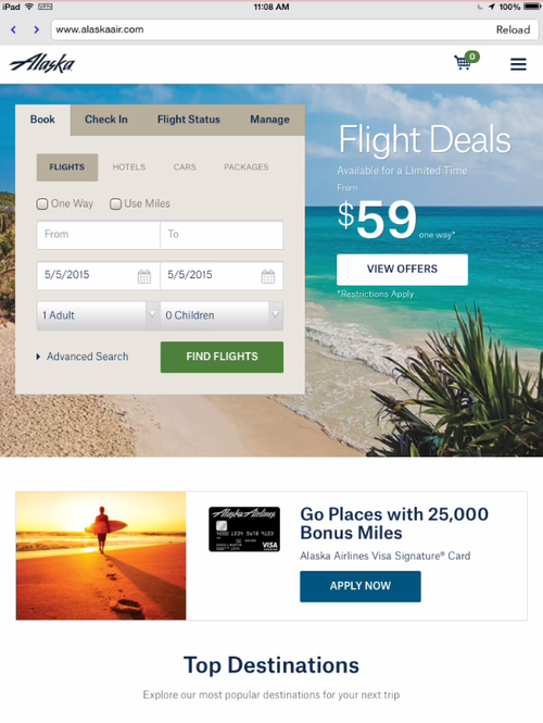
redesigned mobile & tablet experience
The new experience was responsive, with a homepage and navigation that scaled elegantly from a desktop breakpoint all the way down to handheld.
business outcomes
The design was successfully launched in the spring of 2015. As a result of several optimization efforts through A/B testing the site saw a 2.5% conversion rate increase. It was also accessible for people with visual/motor impairments and responsive for mobile and tablet browsers.
But just as importantly, I established the UX team as a strong organization that was a peer to PM and Engineering, and set the organization-up for future success.
customer feedback
Customer feedback to the redesign was extremely positive. Here are a few samples.
tweets from happy fliers
Beyond the operational data that revealed higher engagement with the site, we also received great impromptu feedback from Alaska fliers.


team
My strategic work leading the designers and building the team's ability was an important element of my effort and the most rewarding for me. As part of that effort I created processes and structures to help the team—and the company--grow into a design-first culture.
“It's fair to say Jerrod was responsible for developing the UX practice within our team, and I got to witness the transformation firsthand."
- UX Designer, Alaska Airlines