
Omni-channel Rebranding
Elevating a regional brand to the national stage: an omni-channel rebrand.

context & prior experience
Alaska Air started working on a rebranding to help establish its place on the national stage: It had been a highly successful regional airline but was building its national presence. With that change was an opportunity to rebrand itself and all of its assets: From aircraft livery, marketing collateral and crew uniforms, to the kiosks at the airport, its mobile apps and its website. The airline wanted to unveil all elements of the rebranding on the same date, at the same time. I was in charge of rebranding the web experiences, and as Alaska’s primary e-commerce channel, ensuring the web channel had no reduction in conversion rates/revenue.
prior homepage
fresh off the heals of an overall site redesign, alaskaair.com was effective from a conversion rate and UX perspective, but reflected a visual identity/branding that Alaska was moving away from.
prior flight search
Similar to the home page, the flight search page — AlaskaAir.com’s primary means for finding a flight — was effective but off-brand.
process
My first task was to work with stakeholders from Marketing and development to align expectations. This included meeting with the outside brand agency Alaska Air hired to flesh-out the new brand guidelines. From there we established a daily design session wherein all designers on my team worked together on applying the brand elements to our channels. These working sessions culminated in afternoon design critiques wherein all design work was posted and everyone was free to comment on it. This was complemented with a weekly design review by the Marketing team and the brand agency.

A stakeholder review session
As design concepts stabilized I initialized a series of A/B tests to evaluate every critical element of the design concept. I designed these A/B tests as covert experiments, testing elements of the redesign in such a way not to indicate to customers or the market that Alaska was about to rebrand. These tests helped verify our design decisions and provided insight into aspects of the design that needed more work.
redesigned experiences
The website design was unveiled in a coordinated launch across all physical and digital channels in January 2016, the first such coordinated brand launch at Alaska Airlines. (Launching an entire eCommerce redesign across hundreds of pages on a single, pre-determined day is not an easy task!). Due to the covert testing, there were no significant impacts on conversion rates or customer feedback — a large achievement given the sensitivity a complete rebranding has on the end-user experience.
redesigned site
The redesigned homepage addressed the overall brand, but it also performed well from a conversion perspective and it performed well in user testing.

redesigned flight search
We A/B tested several design options on the flight search page before settling on the one on the right. This page is critically important in the customer shopping experience.

Interactive style guide and pattern library
One of the more significant elements behind the redesign--and something that set the design and development team up for future success--was the development of a style guide/pattern library by my team in combination with a front end developer. (Notice the “Ask Jerrod” in the upper right!)
outcome
The updates were part of a larger brand reveal, including all digital properties (mobile apps, web, kiosks, airport electronic signs). Here is the before/after of the various properties.

Omnichannel before
All the digital interfaces before this redesign.
Omnichannel after
All the digital interfaces after this redesign.

Article from Mashable
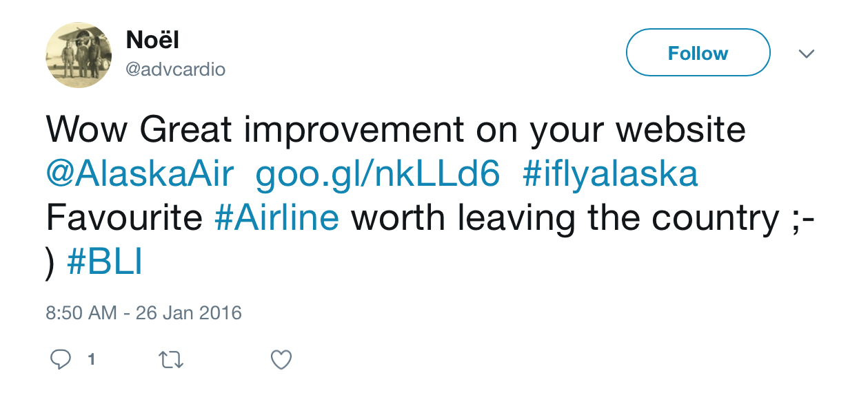
customer feedback
Customer feedback to the redesign was extremely positive.
Some tweets from happy fliers.

team
Just as important to me as an awesome product experience is team and individual practitioner growth. Here's some feedback from a UX professional on my team:
"[Jerrod] helped grow my team into one that is cohesive, respectful, and respected for our design leadership in the organization. His hiring process raised the bar and brought in talented teammates, while his coaching helped everyone on the team to recognize our strengths and opportunities and grow in both areas. He balances data-driven design with best practices and common sense."
- UX Researcher, Alaska Airlines